|
Mega menus have become the default solution for complex navigation, but they often create more problems than they solve. When users hover over a category, they’re suddenly hit with a grid of dozens—sometimes hundreds—of items. This cognitive overload violates a fundamental principle of good UX design: reducing the burden on the user’s working memory.
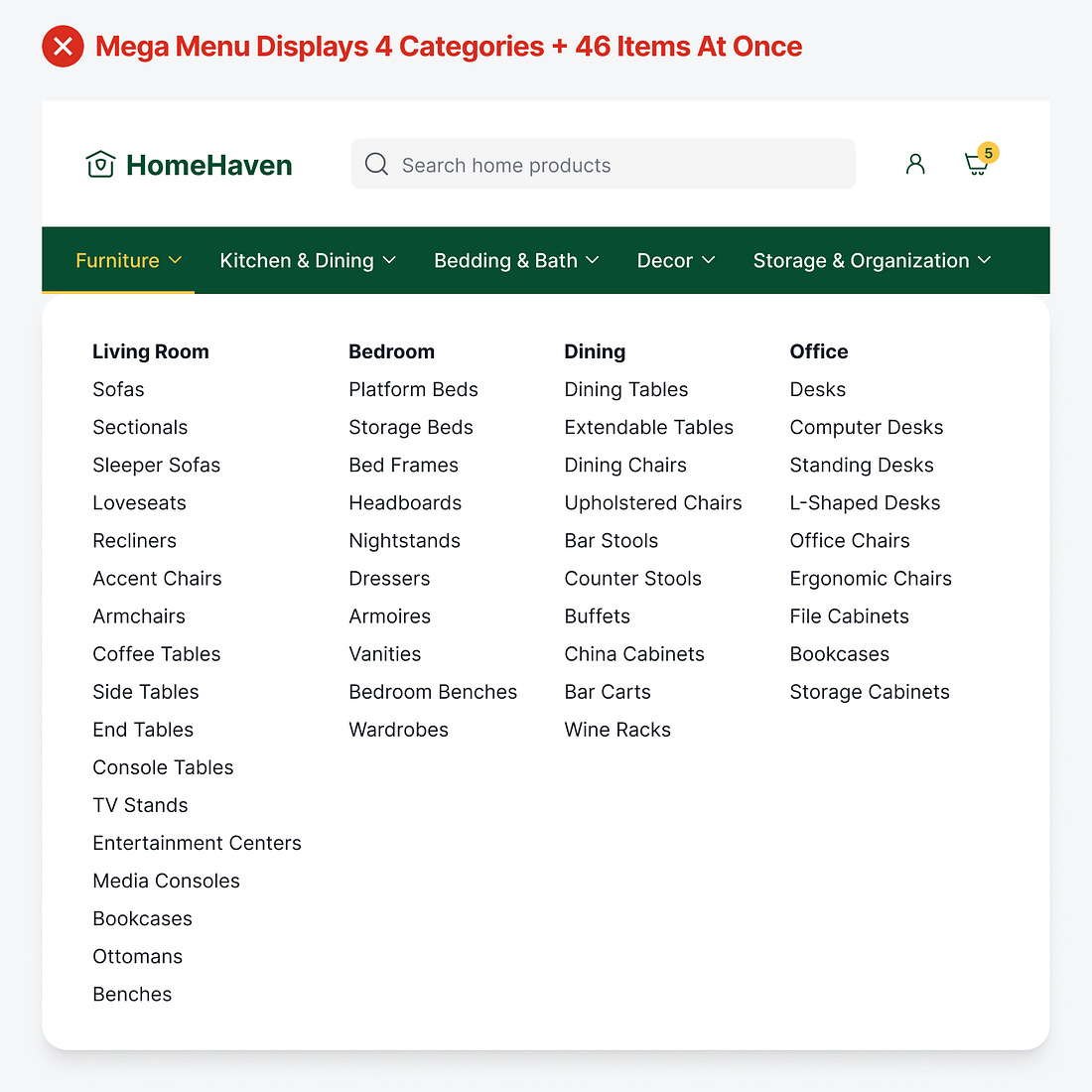 |
Imagine being confronted with 46 items organized into 4 columns. When users open the mega menu, they're trying to hold too many things in their working memory: the item they’re looking for, the category labels they're scanning, and their current position in the navigation structure. The result is working memory overload, where they feel overwhelmed, make slower decisions, or simply give up. ...

Continue reading this post for free in the Substack app
![]()